

CANDOR
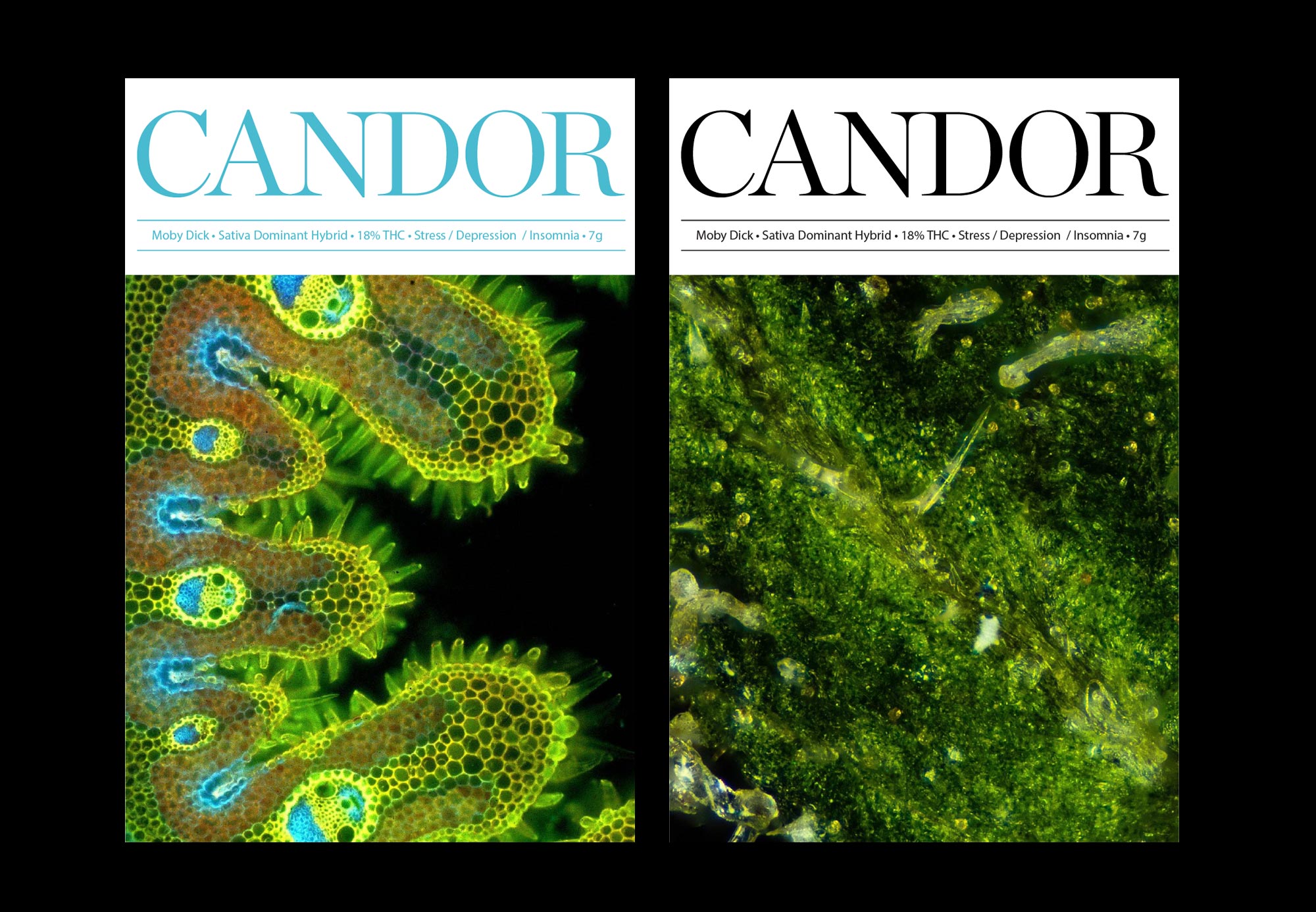
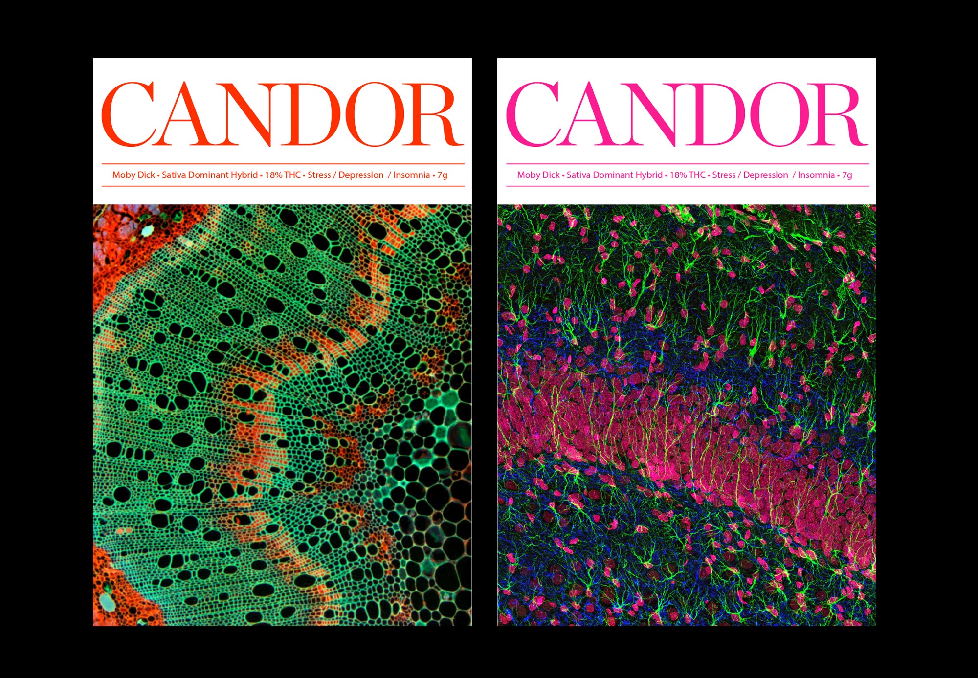
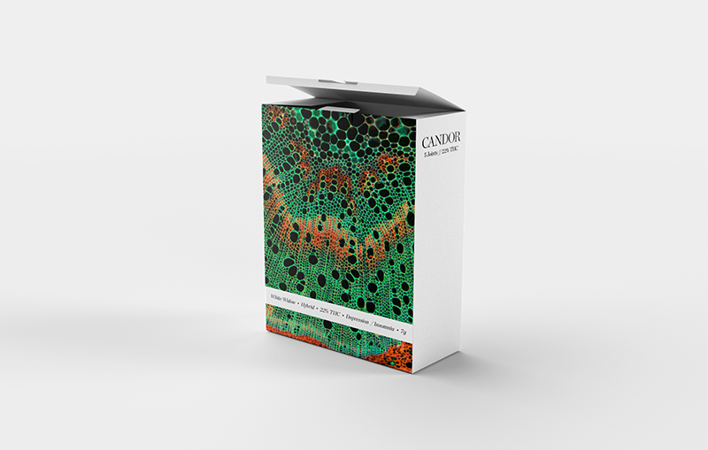
The challenge with CANDOR was a subdivision of a major medical marijuana company. Candor is their consumer-facing division which will be sold in stores across Canada when the government run stores open up. The company wanted to create an consumer line, starting with their two main strains. These strains will be available in a variety of applications like nugs, prerolls, tinctures as well as edibles. Their ask was to create a wordmark as well as packaging.
Because the company wanted to appeal to young professionals, I decided to stay away from the classic weed/stoner imagery.
We used clean typographic treatments, a mature illustration approach and photography of marijuana from an electron microscope to provide various directions that would tell the CANDOR story and speak to the target audience.
With:
Ralph Damman.
Ben Ruby.
Theo Gibson.
Ralph Damman.
Ben Ruby.
Theo Gibson.