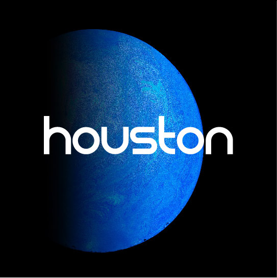
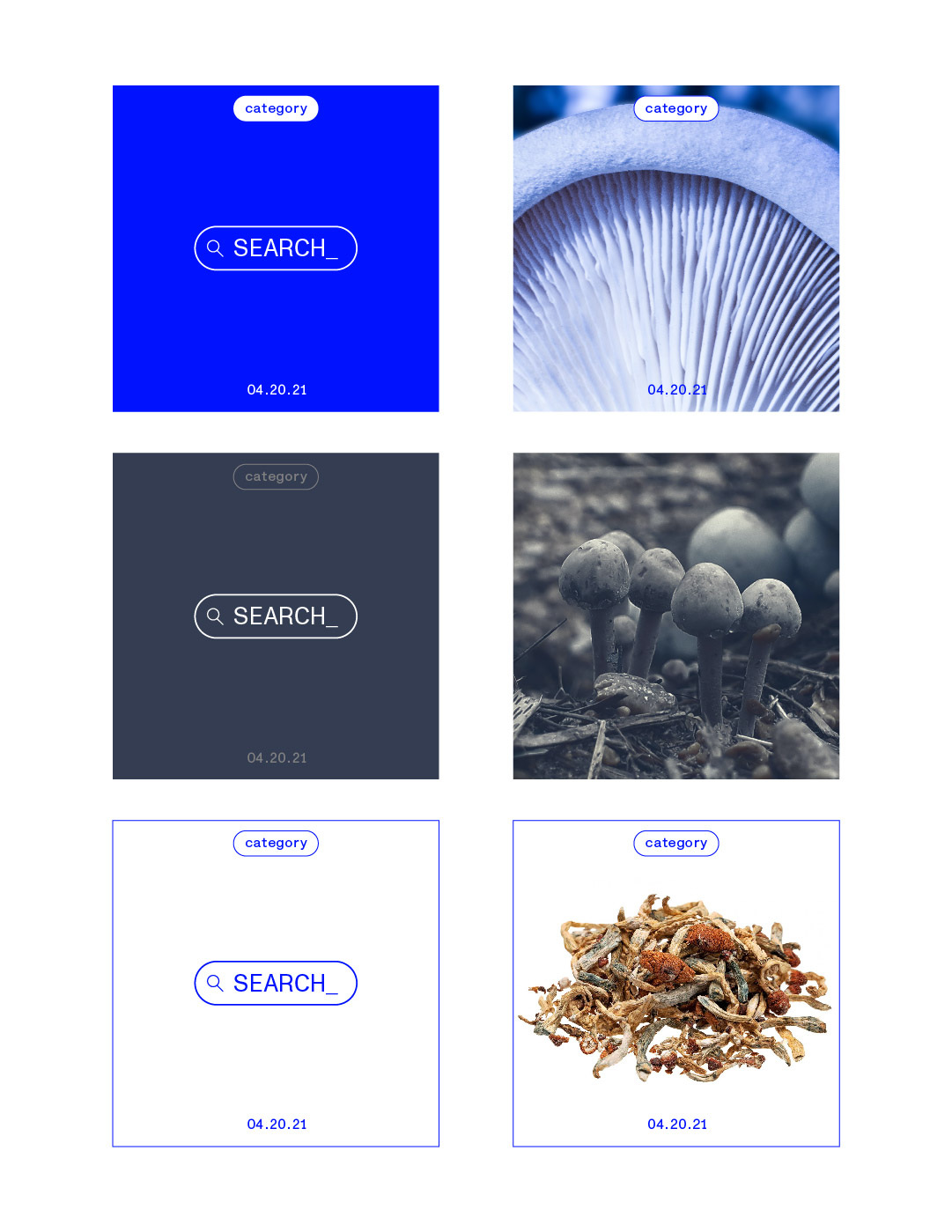

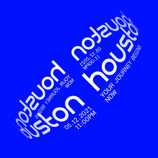
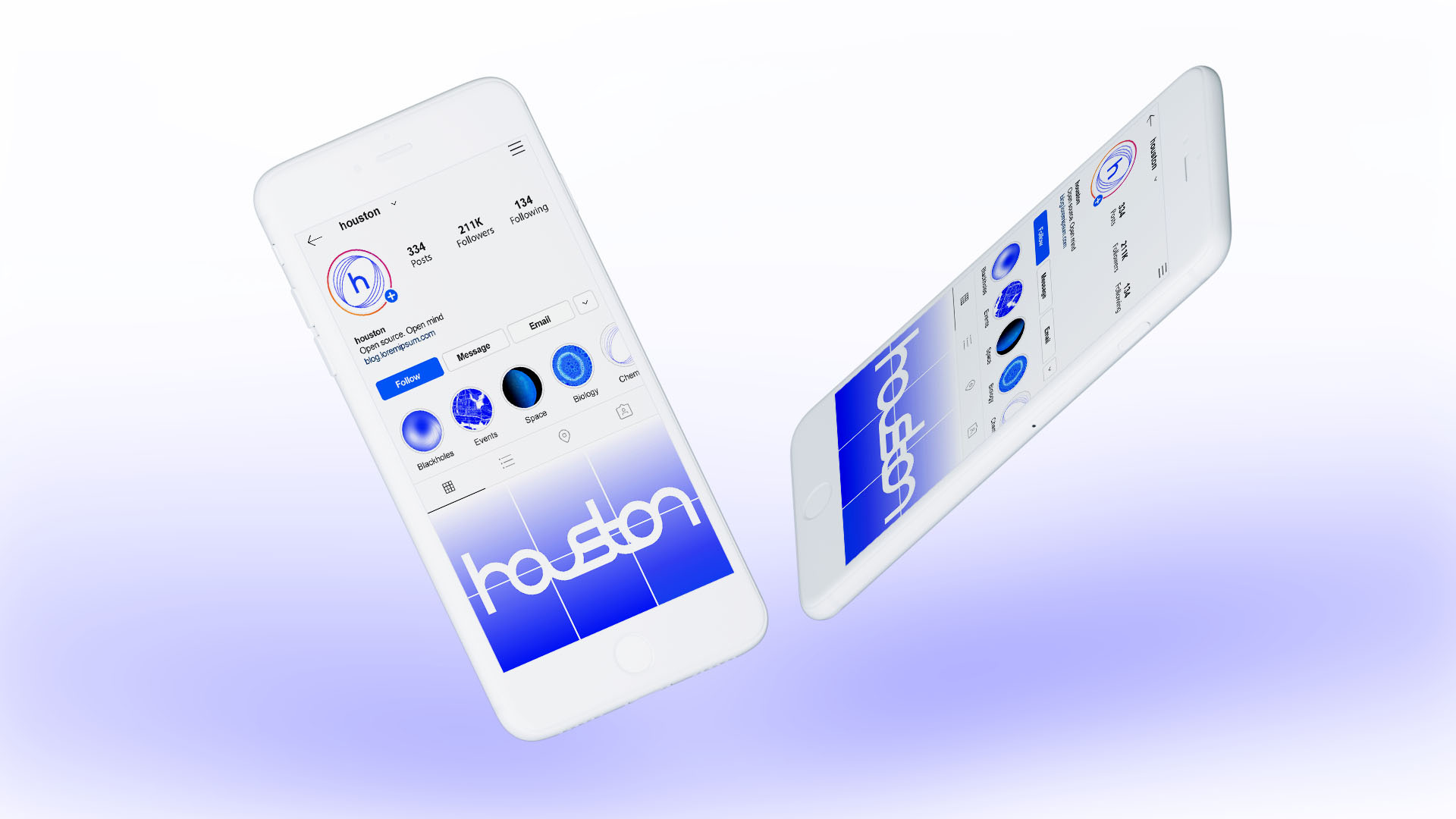
Houston
The brand new companion and guidance app, designed to help people navigating their journey into enlightenment and enhancement through the use of microdosing.
Named after the iconic space age ‘mission control’, we set the brand strategy as being ‘Hero’s Companion’ and a guide for those embarking on this internal and eternal voyage.
Branding was created to transmit Enlightenment, Reassurance & Trust.
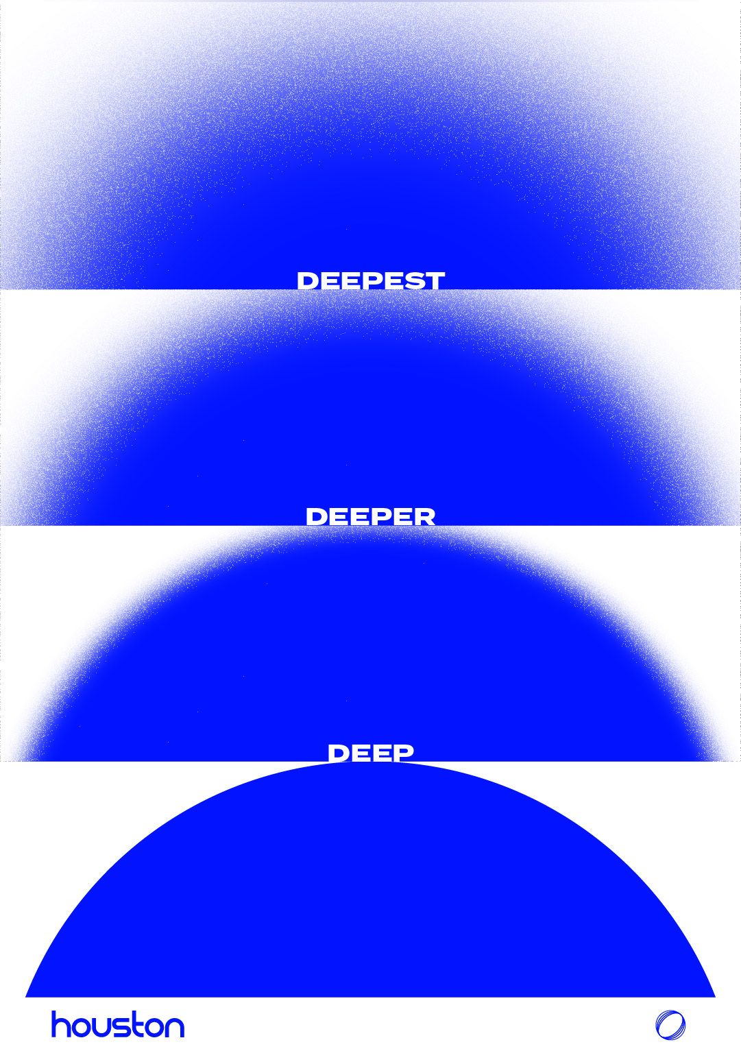
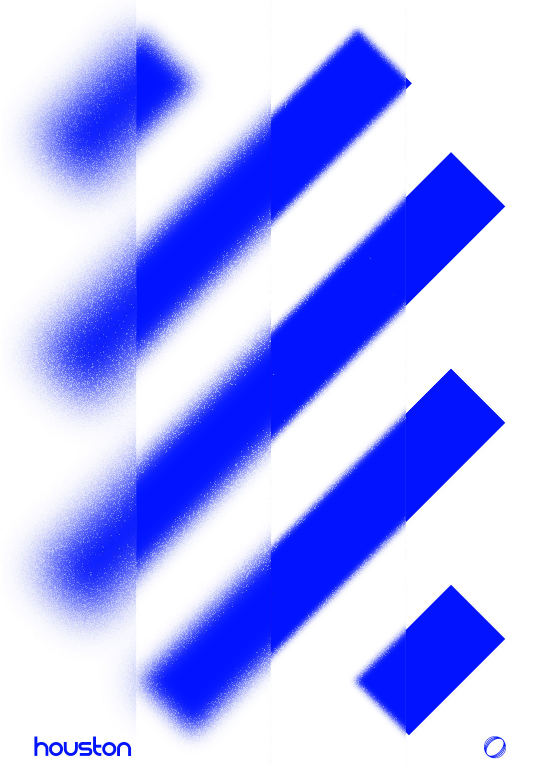
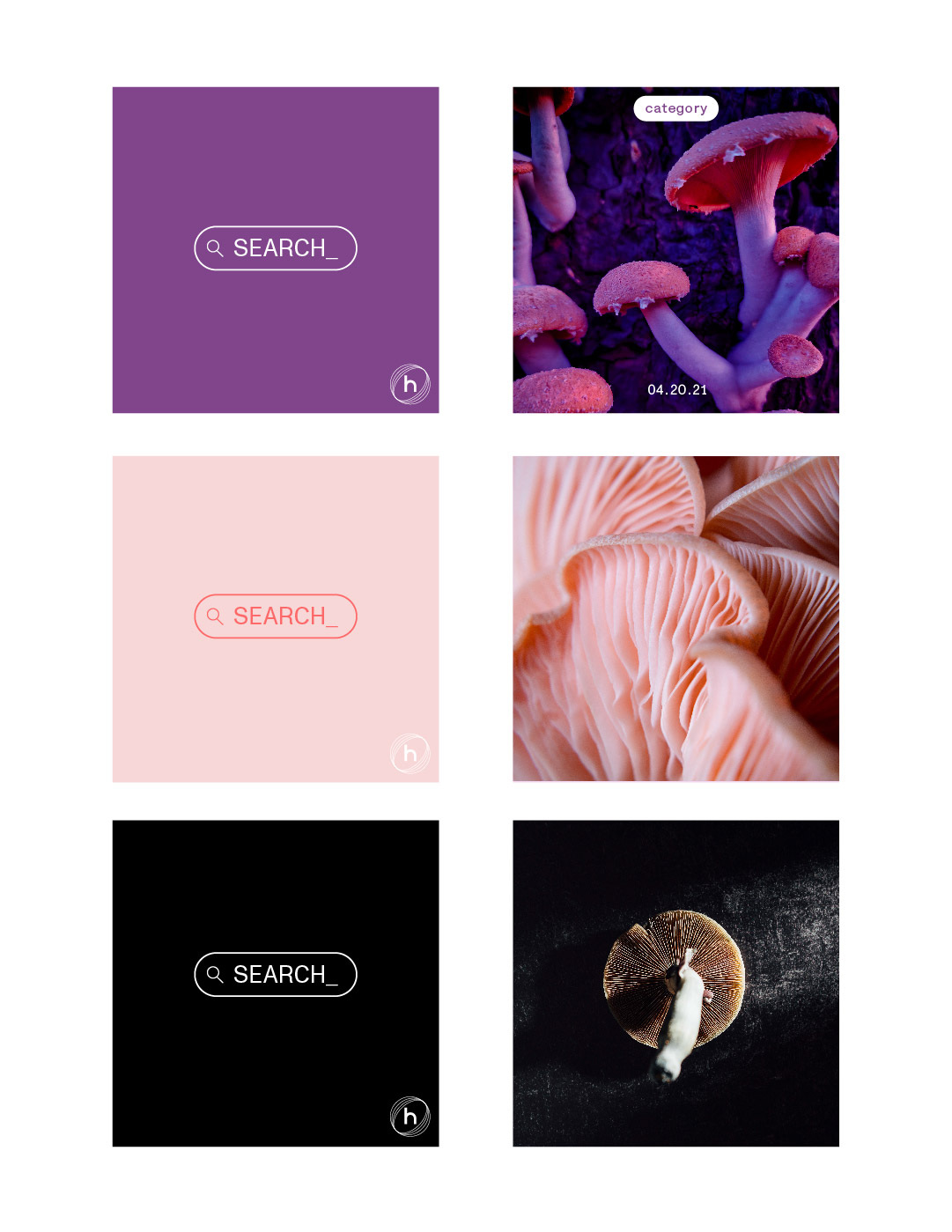
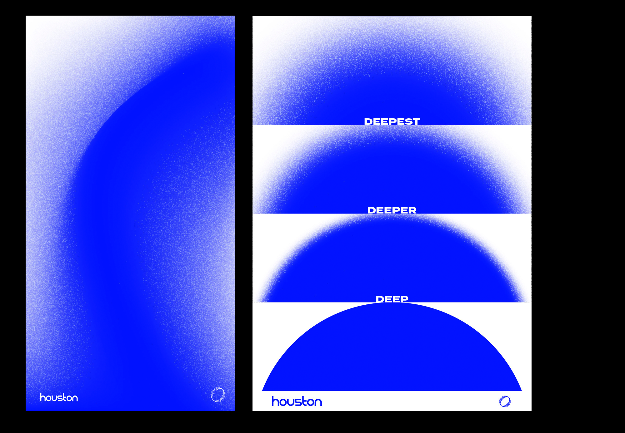
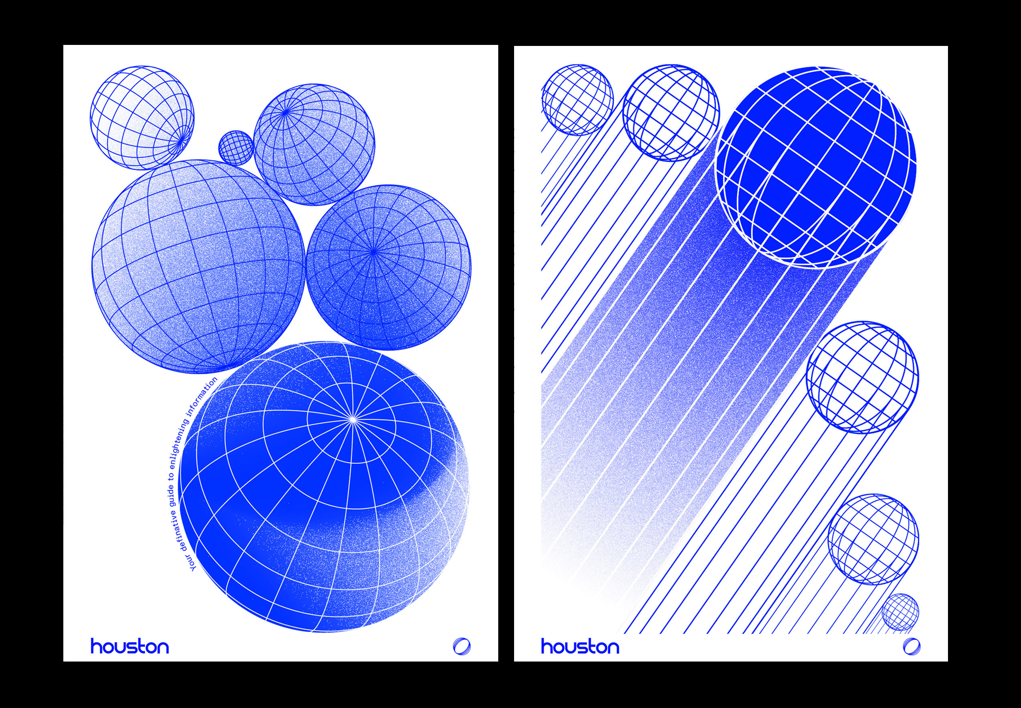
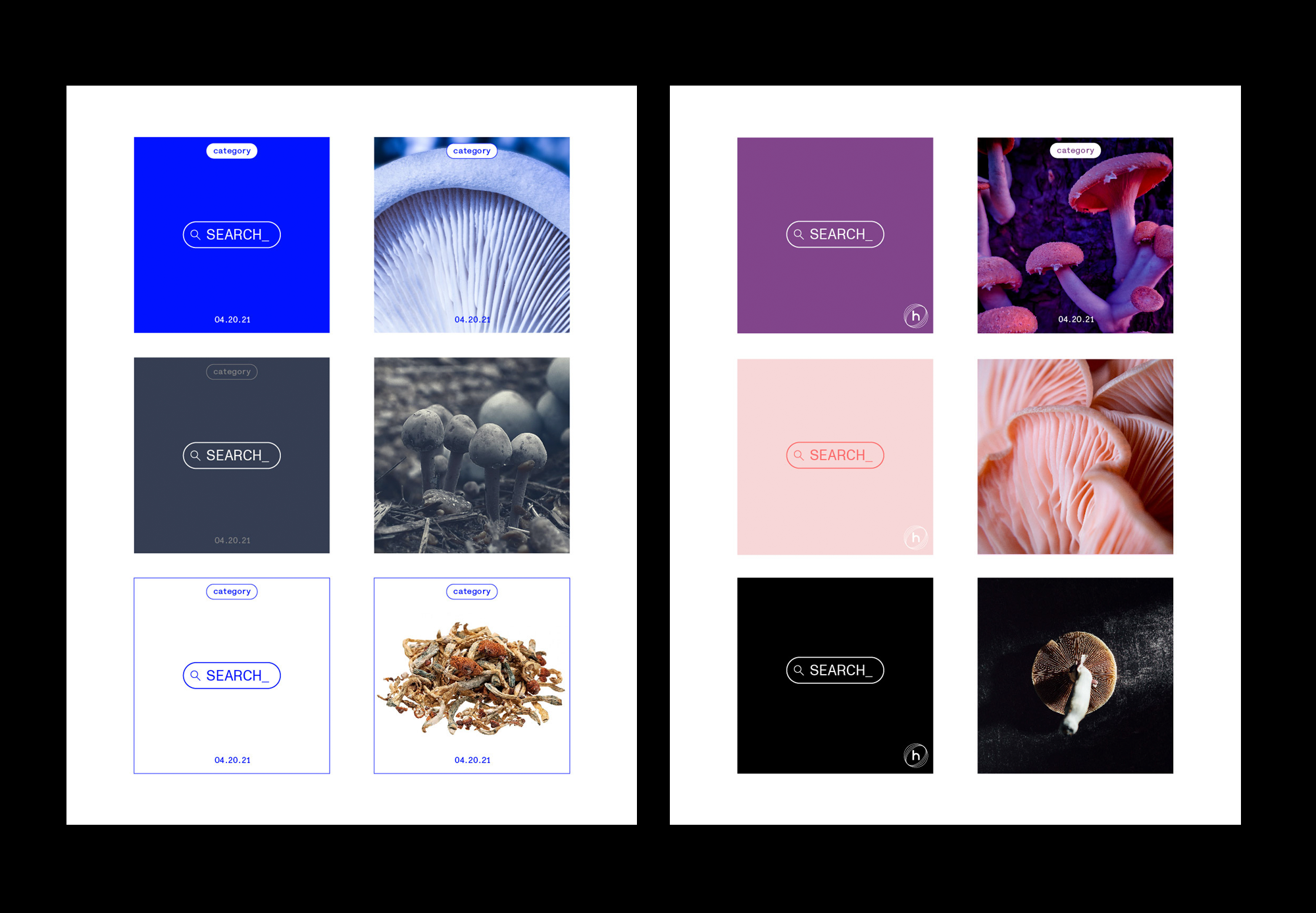
Playing with a central theme of reframing. The Houston brand communicates by reframing perception and being the brand that challenges you to look at your world with a different set of eyes.
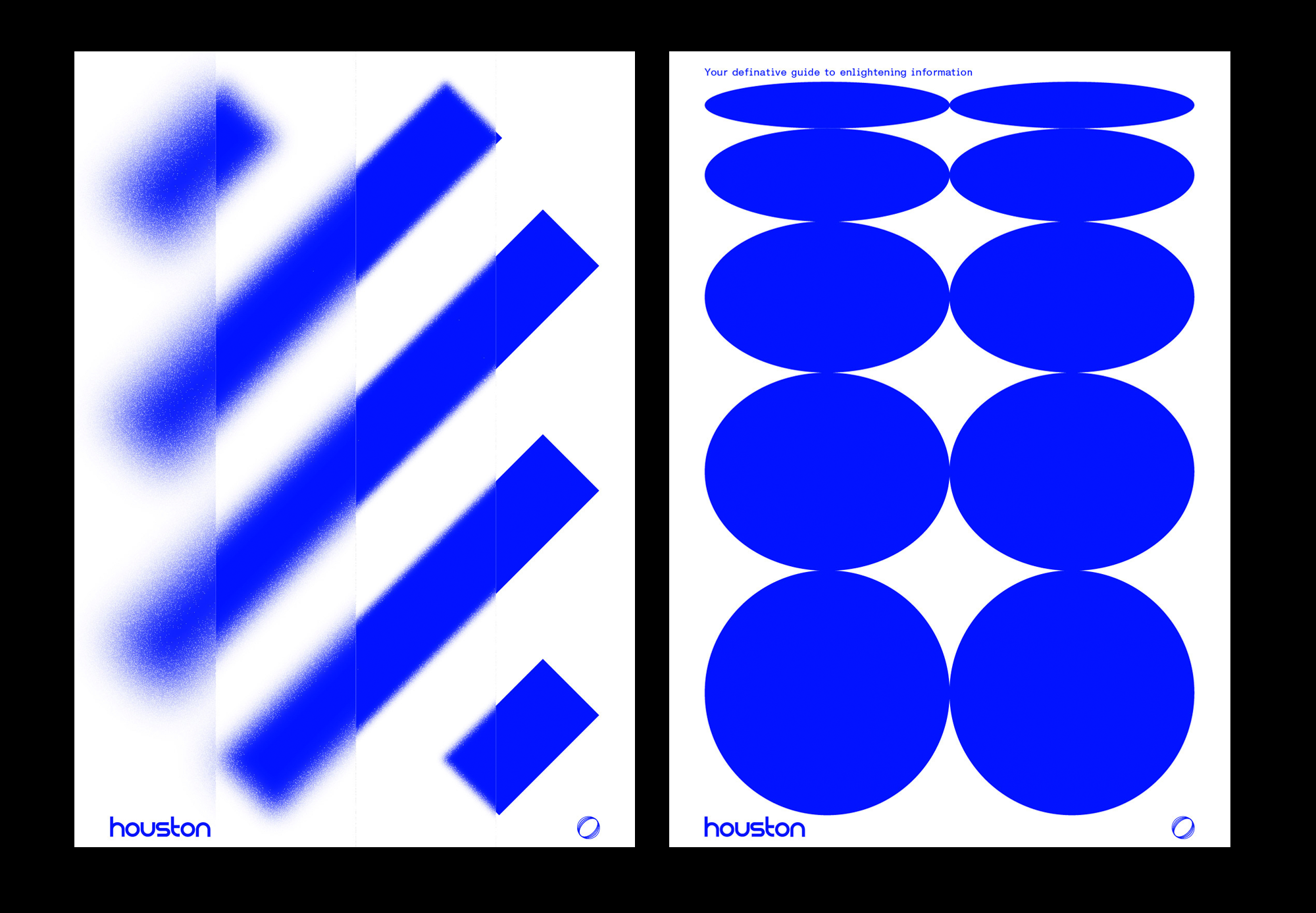
Creating visual parrallels between objects:
MACRO becomes MICRO
ORGANIC becomes INANIMATE
COLOURS move from MONOCHROMATIC to RICH & WELCOMING
The Brand provides movement and transfiguration from one state to the next.
This is reflected in the numerous and ultimately flexibly use of imagery, colour gradients, typography and animation.
Houston is the Guide & Hero’s Companion that moves with you into bold new realms of personal development.
Purpose-built for:
SEEKERS, SEARCHERS & EXPLORERS OF THE LIGHT.
The brand new companion and guidance app, designed to help people navigating their journey into enlightenment and enhancement through the use of microdosing.
Named after the iconic space age ‘mission control’, we set the brand strategy as being ‘Hero’s Companion’ and a guide for those embarking on this internal and eternal voyage.
Branding was created to transmit Enlightenment, Reassurance & Trust.
Playing with a central theme of reframing. The Houston brand communicates by reframing perception and being the brand that challenges you to look at your world with a different set of eyes.
Creating visual parrallels between objects:
MACRO becomes MICRO
ORGANIC becomes INANIMATE
COLOURS move from MONOCHROMATIC to RICH & WELCOMING
The Brand provides movement and transfiguration from one state to the next.
This is reflected in the numerous and ultimately flexibly use of imagery, colour gradients, typography and animation.
Houston is the Guide & Hero’s Companion that moves with you into bold new realms of personal development.
Purpose-built for:
SEEKERS, SEARCHERS & EXPLORERS OF THE LIGHT.


Push Athlete
As Creative Director at Push Technologies I was tasked with branding our new offering, PUSH Athlete. PUSH Athlete was our newest direct to consumer product and unlike our Pro product, the user would be using this without the assistance of a professional strength coach on site.
Here’s the breakdown.
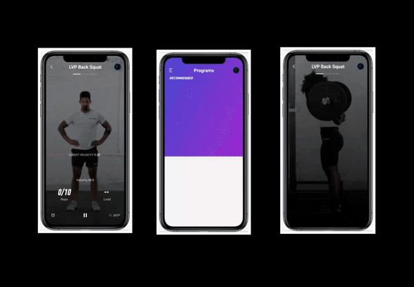
Strength, Power, Speed, & Endurance (SPSE) are the four basic elements of athleticism. Train smarter with strength analytics and personalized data that detail exactly how you can reach your performance goals.
As Creative Director at Push Technologies I was tasked with branding our new offering, PUSH Athlete. PUSH Athlete was our newest direct to consumer product and unlike our Pro product, the user would be using this without the assistance of a professional strength coach on site.
Here’s the breakdown.
Strength, Power, Speed, & Endurance (SPSE) are the four basic elements of athleticism. Train smarter with strength analytics and personalized data that detail exactly how you can reach your performance goals.
Our training programs are designed by the leading experts behind some of the world’s best athletes. Delivered through the most engaging training app around.
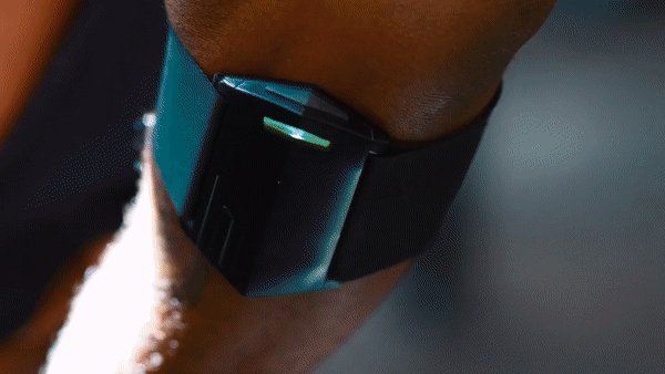
The PUSH Band delivers rep-by-rep guidance using velocity-based training (VBT) so you train at the perfect performance-enhancing intensity for every session.
With:
Patrick Leung.
Dhani Oks.
Tyler Hughes.
The PUSH Band delivers rep-by-rep guidance using velocity-based training (VBT) so you train at the perfect performance-enhancing intensity for every session.
With:
Patrick Leung.
Dhani Oks.
Tyler Hughes.

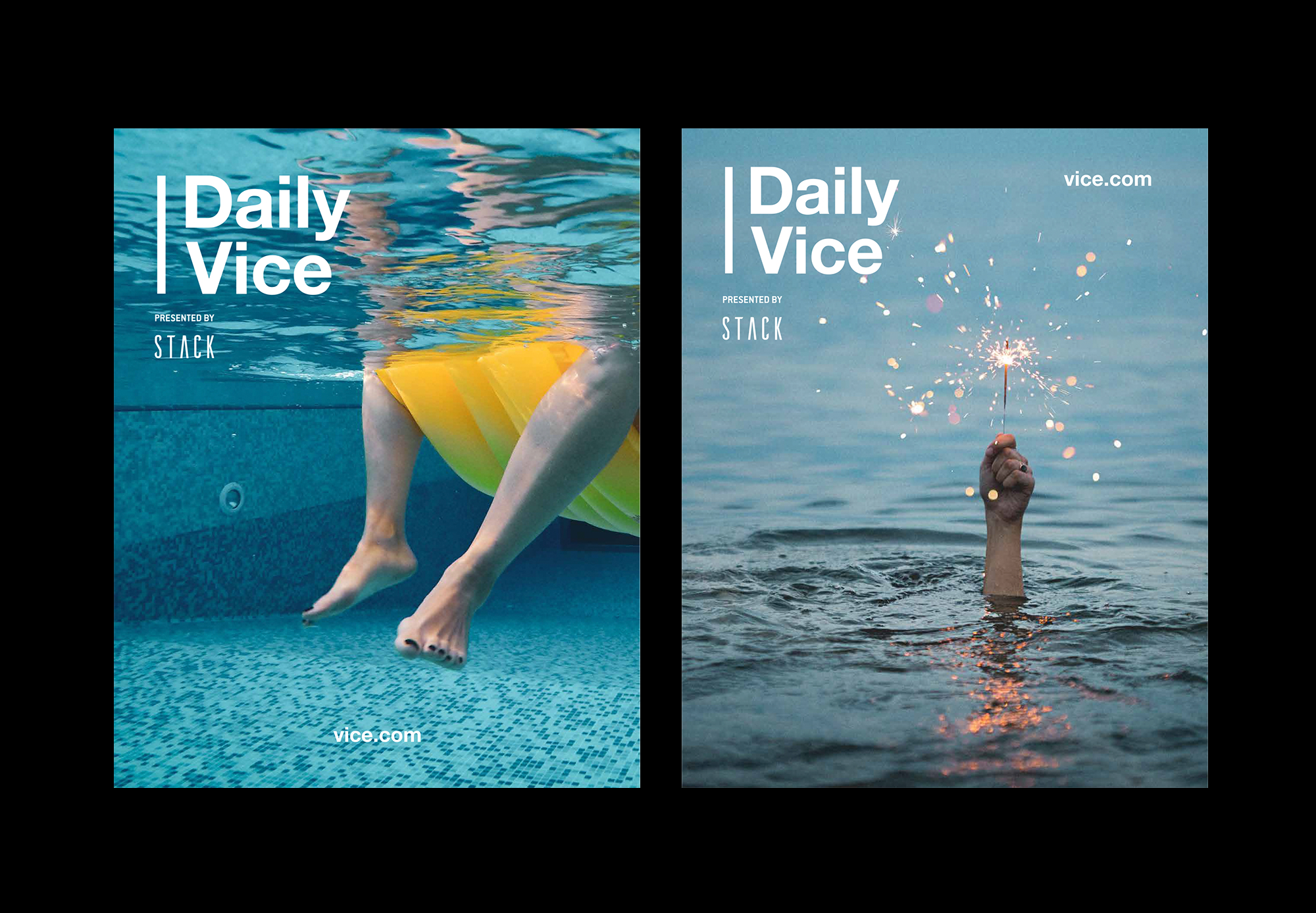
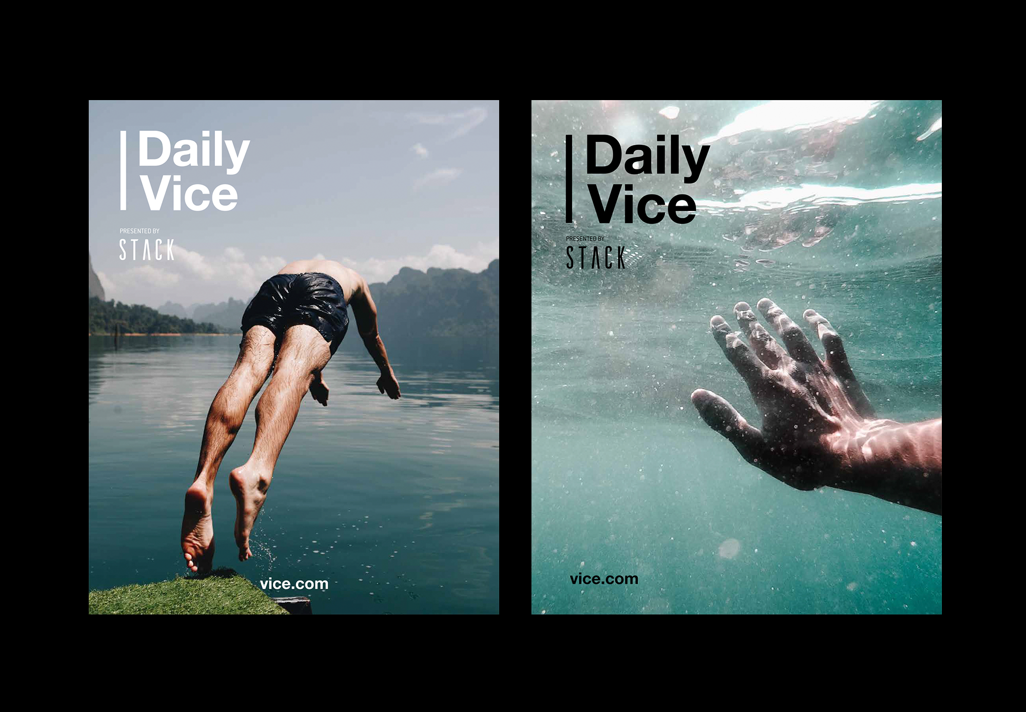

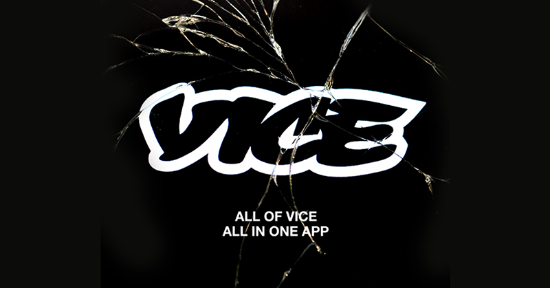
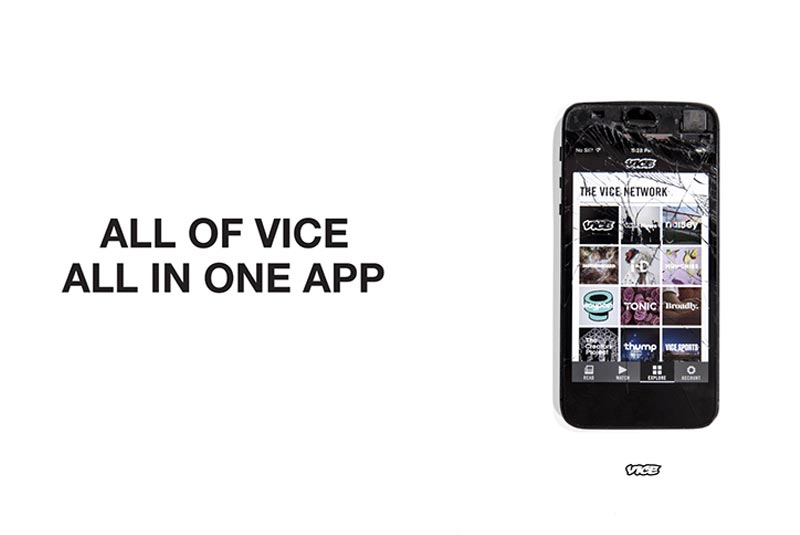
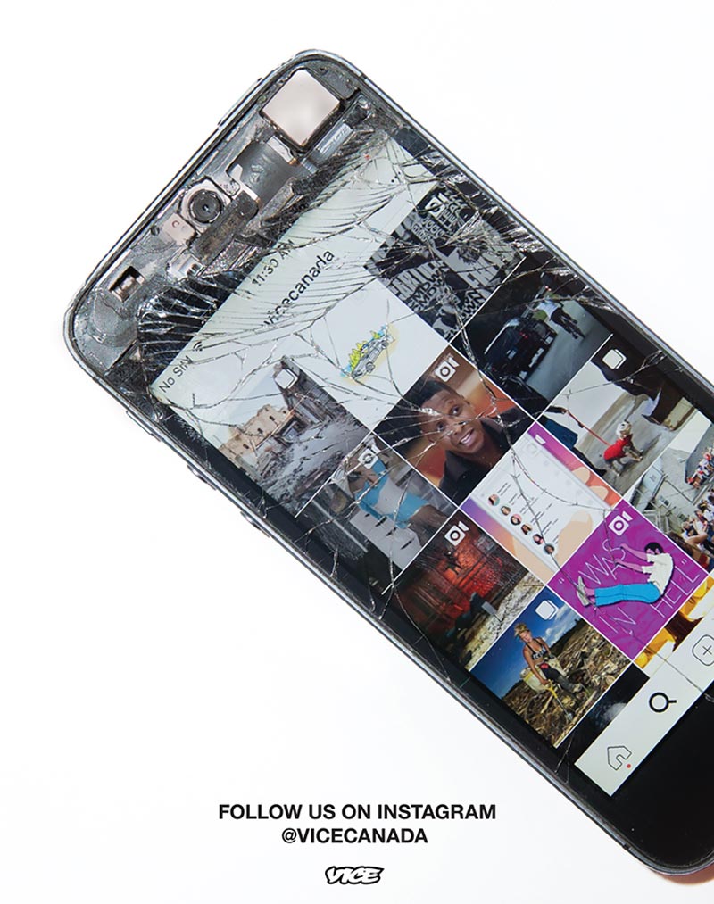
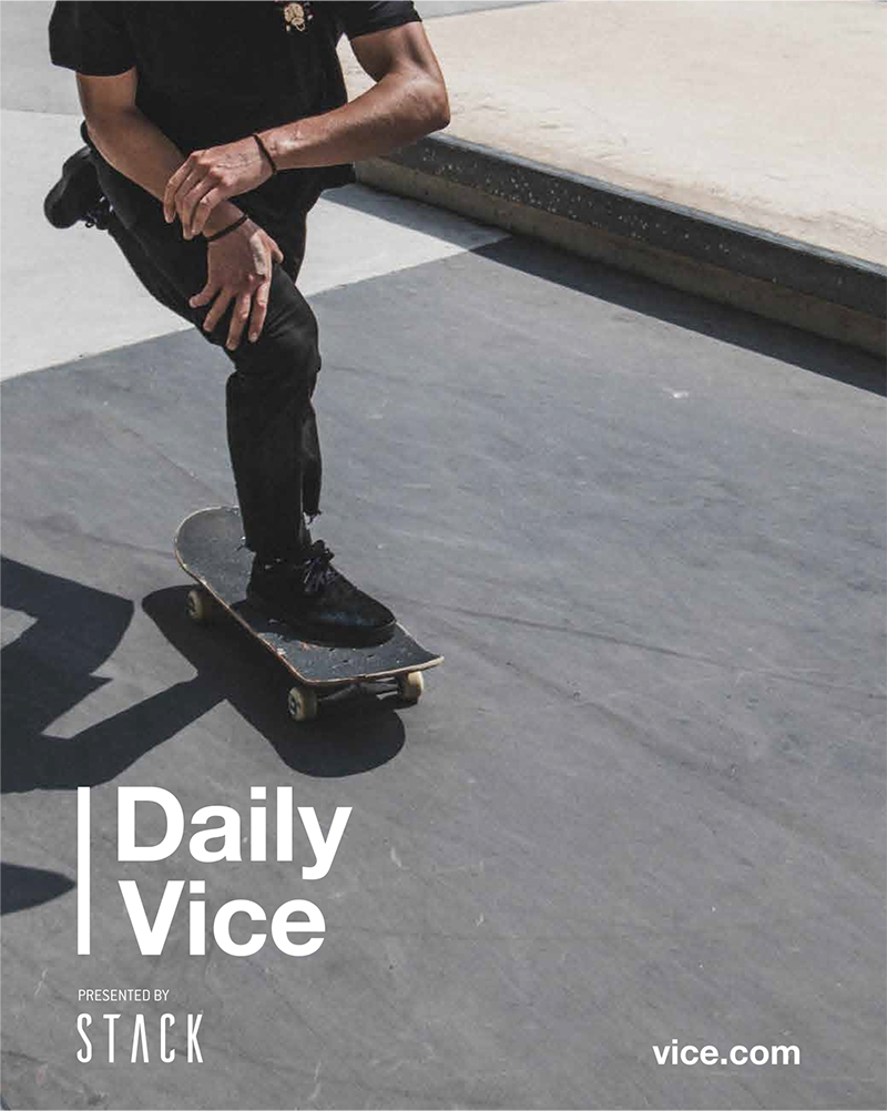
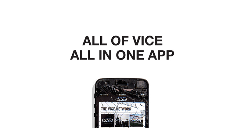
Vice App
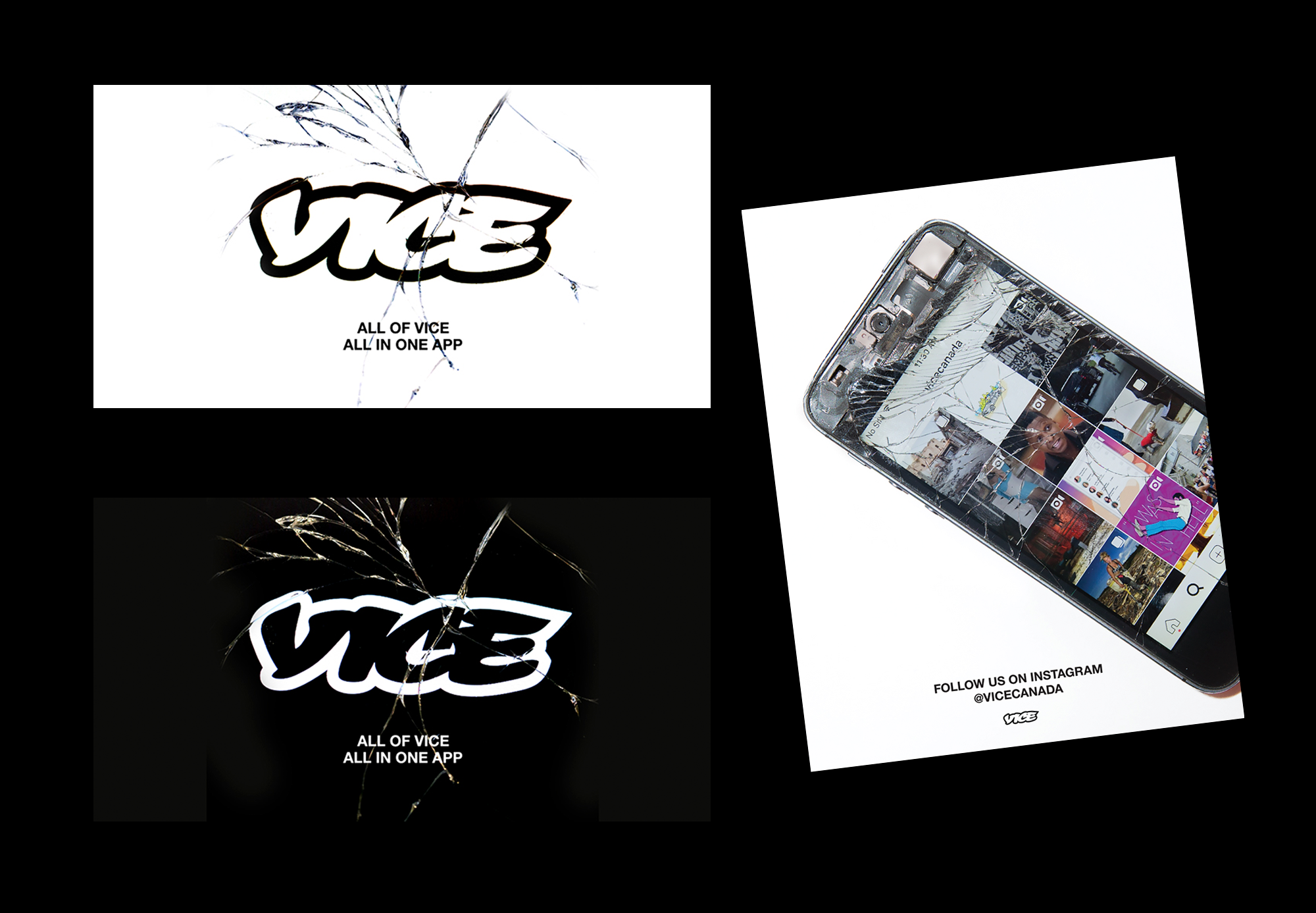
Apps are on phones and phone screens shatter. As simple as that is, we felt there was a quality within that look that was 'real' as well as very appropriate for the VICE brand and audience.
Apps are on phones and phone screens shatter. As simple as that is, we felt there was a quality within that look that was 'real' as well as very appropriate for the VICE brand and audience.