















WORKING ART COLLECTIVE
Brand identity, logo system, visual direction
Working Art builds entertainment-driven commerce. Live-selling, social commerce, content from idea to checkout. The team came from film and production, so a stiff corporate mark was never going to fit.
The brief was one word: handmade. Something that looked like a person made it, not a template. I drew the ART lettering by hand in a loose graffiti bubble style, then rebuilt it as clean vectors so it could scale to any size without falling apart. A tight condensed grotesk sits above it for WORKING, with collective tucked underneath. Playful on the bottom, sharp on the top.
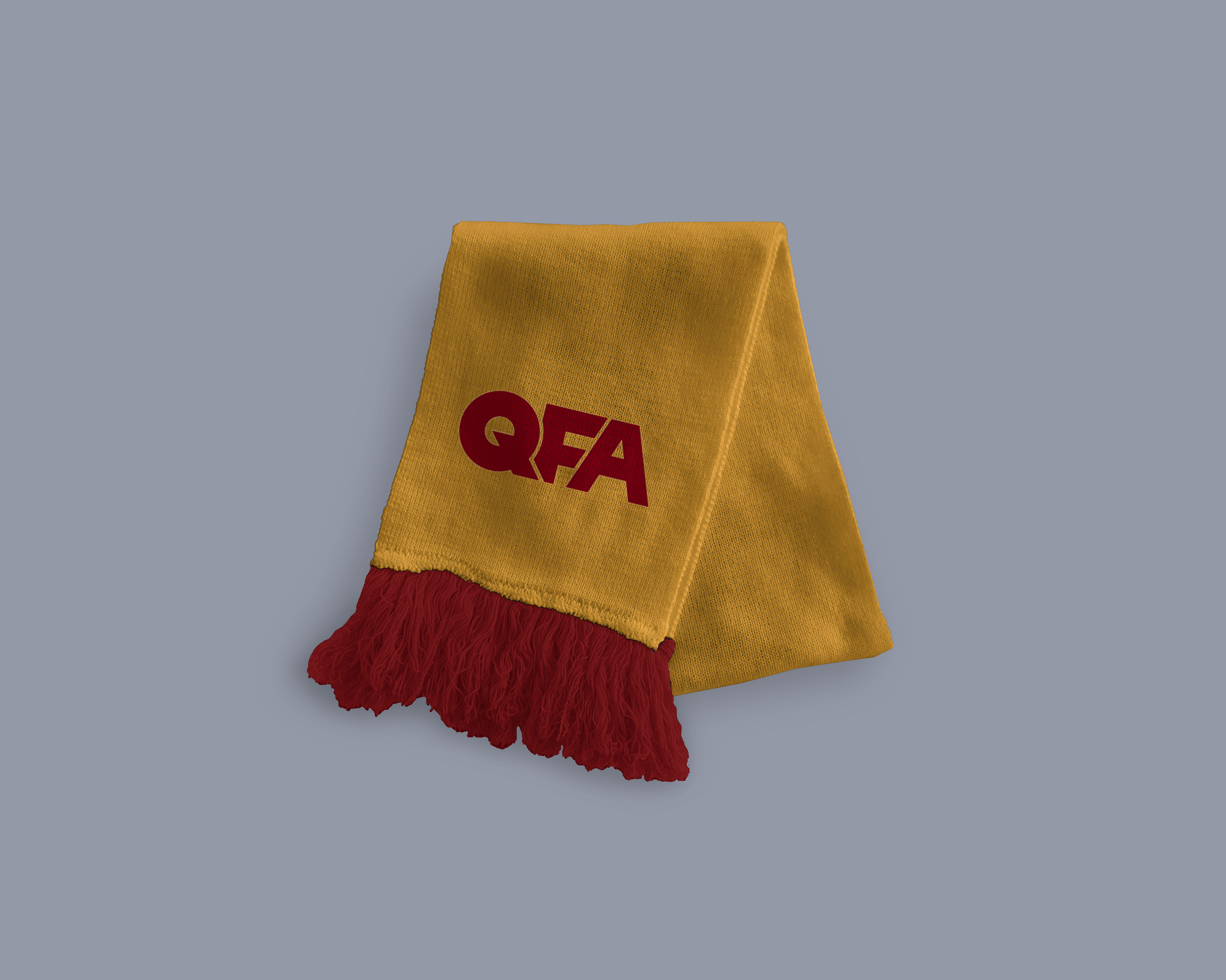
The system was built to stretch. Flat one-colour for stamps and small applications, outlined for print and merch, and inflated 3D renders with real highlights and shadow for motion, social and title cards. Same mark, completely different energy depending on where it lands.
Delivered as a full identity package: logo suite, colour palette, type system, usage rules and a branded deck template the team could run themselves.


BET99
15 second spot, directed start to finish
Sports betting ads shout. This one had fifteen seconds to get in, say something and get out before anyone reached for the remote.
I shot it with Austin Matthews: black and white photography torn against Bet99 green, a jersey that does the talking, and one line that lands every time: Every Game Starts at BET99. I directed it, worked with Austin on set, and handled the post and motion graphics myself.
The neon end card closes every cut. It was built in a few versions so the spot could run wherever it needed to, from broadcast to oddball screens.
Client: Bet99. Direction, post and motion graphics by Joel Tellier.
Client: Bet99. Direction, post and motion graphics by Joel Tellier.


COMPLETEIQ
Brand identity for an AI claims product
Insurance software usually looks like insurance software. CompleteIQ needed to look like what the AI actually does: fast, clear and a little bit alive.
As creative director I built the full brand package, from the logo and a purple gradient system to business cards, a sales deck and a hype teaser cut from molten lava footage, because a launch should feel like an event.
The system is built to travel. The same mark shows up on posters, devices, cards and decks, and it is always obvious it is the same company.
Client: CompleteIQ. Creative direction and brand identity by Joel Tellier.
Watch: The Future of Claims Starts Here
Watch: CompleteIQ, The Why
Client: CompleteIQ. Creative direction and brand identity by Joel Tellier.
Watch: The Future of Claims Starts Here
Watch: CompleteIQ, The Why
BRUT
Brand identity for a natural wine business
Brut shares the wines sommeliers actually drink after work: small producers, native grapes, interesting places, and none of it available at the LCBO. Events, consulting, a bottle shop and curated monthly packs, all sustainable, organic, biodynamic and natural.
I designed the brand identity: logo, type, colour, labels and the system that carries it from bottle to event poster.
The brand had to feel like sourdough bread and unpasteurized cheese: slow food, real makers, nothing precious. Confident type, honest materials and room for the wine to be the point.
Client: Brut. Brand identity by Joel Tellier.
Client: Brut. Brand identity by Joel Tellier.